
Get the most accurate NCERT Solutions for Class 11 Economics Chapter 4 Presentation of Data here. Updated for the 2026-27 academic session, these solutions are based on the latest NCERT textbooks for Class 11 Economics. Our expert-created answers for Class 11 Economics are available for free download in PDF format.
Detailed Chapter 4 Presentation of Data NCERT Solutions for Class 11 Economics
For Class 11 students, solving NCERT textbook questions is the most effective way to build a strong conceptual foundation. Our Class 11 Economics solutions follow a detailed, step-by-step approach to ensure you understand the logic behind every answer. Practicing these Chapter 4 Presentation of Data solutions will improve your exam performance.
Class 11 Economics Chapter 4 Presentation of Data NCERT Solutions PDF
NCERT Solution for Class 11 Statistics for chapter 4 Presentation of Data
Answer the following questions, 1 to 4, choosing the correct answer.
Question 1. Bar diagram is a
i. one-dimensional diagram
ii. two-dimensional diagram
iii. diagram with no dimension
iv. none of the above
Answer: i. one-dimensional diagram
Explanation: Bar diagrams are called one-dimensional because it is only the height of the the bars that matters not the width.
Question 2. Data represented through a histogram can help in finding graphically the
i. mean
ii. mode
iii. median
iv. non-of the above
Answer: ii. mode
Explanation: Histogram consists of a set of rectangles adjacent to each other in which each rectangle represents the class interval with the frequency.
Question 3. Ogives can be helpful in locating graphically the
i. mean
ii. mode
iii. median
iv. non-of the above
Answer: iii median
Explanation: Ogive or cumulative frequency curve are constructed by plotting cumulative frequency data on the graph paper, in the form of a smooth curve. The intersection point of two ogive curves i.e. ‘less than’ and ‘more than’ ogive curves is called median.
Question 4. Data represented through arithmetic line graph help in understanding
(i) Long term trend
(ii) Cyclicity in data
(iii) seasonality in data
(iv) all the above
Answer: i. long term trend
Explanation: Arithmetic line graphs are also called time series graph. These graphs are used to present the information which is given over a period of time. Here time is plotted on X axis and value of variable on Y axis.
Question 5. State whether the following statements are True or False.
(i) Width of bars in a bar diagram need not to be equal.
(ii) Width of rectangles in a histogram should essentially be equal
(iii) Histogram can only be formed with continuous classification of data.
(iv) Histogram and column diagram are the same method of presentation of data.
(v) Mode of a frequency distribution can be known graphically with the help of a histogram.
(vi) Median of a frequency distribution cannot be known from the ogives.
Answer:
(i) Width of bars in a bar diagram need not to be equal. – False
Reason: In bar diagrams all bars needs to be of equal width and also at equal distance from each other.
(ii) Width of rectangles in a histogram should essentially be equal – False
Reason: Width of rectangles in a histogram may or may not be equal it depends on the width of class intervals.
(iii) Histogram can only be formed with continuous classification of data. – True
Reason: A histogram is never drawn for a discrete variable/data. If the classes are not continuous they are first converted into continuous classes and then histogram is drawn.
(iv) Histogram and column diagram are the same method of presentation of data. – False
Reason: A histogram is a two dimensional diagram with set of rectangles with no spacing in between. On the other hand column (bar) diagram is a one-dimensional diagram with equal space between every Column (bar). Histogram is never drawn for a discrete variable/data whereas column diagram can be drawn for discrete variable/ data.
(v) Mode of a frequency distribution can be known graphically with the help of a histogram. – True
Reason: The highest rectangle of the histogram gives the value of mode of the frequency distribution
(vi) Median of a frequency distribution cannot be known from the ogives. - False
Reason: The intersection point of two ogive curves i.e. ‘less than’ and ‘more than’ ogive curves gives the value of median.
Question 6. What kinds of diagrams are more effective in representing the following?
(i) Monthly rainfall in a year.
(ii) Composition of the population of Delhi by religion
(iii) Components of cost in a factory
Answer:
i. Simple bar diagram
Reason: Monthly rainfall in a year is a discrete variable hence it can be best represented by a simple bar diagram with rainfall on Y-axis and months in the year on the X- axis.
ii. Component bar diagram
Reason: Component bar diagrams or sub-divided bar diagrams are to be used, if the total values of the given data are divided into various sub-parts or components. In this case the total population of Delhi can be sub-divided in terms of religion and can be presented by a component bar diagram.
iii. Pie diagram or pie chart
Reason: A pie diagram or circular diagram also know as pie chart represents a circle whose area is proportionally divided into the components which it represents. The components of cost in a factory can be easily represented by the pie chart. The circle will represent the total cost and different sectors or portions of the circle will represent the various components of cost according to their respective percentage share in total cost.
Question 7. Suppose you want to emphasise the increase in the share of urban non-workers and lower level of urbanisation in India as shown in Example 4.2. How would you do it in the tabular form?
Answer: To showcase the increase in the share of urban non-workers and lower level of urbanisation in India, the data given in the example 4.2 (Case 2, page no.41) can be tabulated as follows:
|
Urban areas |
Rural areas |
Total |
|
|
Worker population |
9 |
31 |
40 |
|
Non- workers population |
19 |
43 |
62 |
|
Total |
28 |
74 |
102 |
From the above table we can see that out of total population of 102 crore, 74 crore people are residing in rural India and only 28 crore people are living in urban areas. This clearly indicates the low levels of urbanisation in the country.
Higher share of urban non-workers can be indicated from the fact that 19 crores people out of total 28 crore population in urban areas are non-working (i.e. 67.85% urban population is non-working), as compared to rural India where 43 crore out of 74 crore people are non- working (i.e. 58.1% of rural population is non-working).
Question 8. How does the procedure of drawing a histogram differ when class intervals are unequal in comparison to equal class intervals in a frequency table?
Answer: Histogram consists of a set of rectangles adjacent to each other in which each rectangle represents the class interval with the frequency.
If the class intervals are of equal width, the area of the rectangles is proportional to their respective frequencies.
However, for some type of data, it is suitable, at times essential, to use varying width of class intervals.
For graphical illustration of such data, height for area of a rectangle is the quotient of height (i.e. frequency) and base (i.e. width of the class interval).
When intervals are equal, i.e. when all rectangles have the same base, area can easily be represented by the frequency of any interval for purposes of comparison.
But when class intervals are unequal i.e., bases vary in width, the frequencies (height of the rectangle) must be adjusted by calculating frequency density i.e. (class frequency divided by the width of the class interval) to yield comparable measurements.
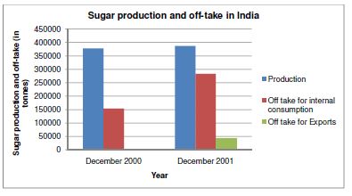
Question 9. The Indian Sugar Mills Association reported that, ‘Sugar production during the first fortnight of December 2001 was about 3,87,000 tonnes as against 3,78,000 tonnes during the same fortnight last year (2000). The off-take of sugar from factories during the first fortnight of December 2001 was 2,83,000 tonnes for internal consumption and 41,000 tonnes for export as against 1,54,000 tonnes for internal consumption and nil for exports during the same fortnight last season.’
(i) Present the data in tabular form.
(ii) Suppose you were to present these data in diagrammatic form which of the diagrams would you use and why?
(iii) Present these data diagrammatically.
Answer:
(i) Data in the tabular form is as follows:
|
Sugar production and off-take in India |
|||
|
Year |
Production (in tones) |
Off-take for internal consumption (in tones) |
Off take for Exports (in tones) |
|
December 2000 |
3,78,000 |
1,54,000 |
0 |
|
December 2001 |
3,87,000 |
2,83,000 |
41,000 |
Source: The Indian Sugar Mills Association Report
(ii) To present this data in diagrammatic form we will use multiple bar diagrams, because they are used for comparing two sets of data for different classes or years effectively.
(iii) Diagrammatic presentation of the data:
Question 10. The following table shows the estimated sectoral real growth rates (percentage change over the previous year) in GDP at factor cost.
|
Year |
Agriculture and allied sectors |
Industry |
Services |
|
1994-95 |
5.0 |
9.2 |
7.0 |
|
1995-96 |
-0.9 |
11.8 |
10.3 |
|
1996-97 |
9.6 |
6.0 |
7.1 |
|
1997-98 |
-1.9 |
5.9 |
9.0 |
|
1998-99 |
7.2 |
4.0 |
8.3 |
|
1999-2000 |
0.8 |
6.9 |
8.2 |
Represent the data as multiple time series graphs.
Answer
Free study material for Economics
NCERT Solutions Class 11 Economics Chapter 4 Presentation of Data
Students can now access the NCERT Solutions for Chapter 4 Presentation of Data prepared by teachers on our website. These solutions cover all questions in exercise in your Class 11 Economics textbook. Each answer is updated based on the current academic session as per the latest NCERT syllabus.
Detailed Explanations for Chapter 4 Presentation of Data
Our expert teachers have provided step-by-step explanations for all the difficult questions in the Class 11 Economics chapter. Along with the final answers, we have also explained the concept behind it to help you build stronger understanding of each topic. This will be really helpful for Class 11 students who want to understand both theoretical and practical questions. By studying these NCERT Questions and Answers your basic concepts will improve a lot.
Benefits of using Economics Class 11 Solved Papers
Using our Economics solutions regularly students will be able to improve their logical thinking and problem-solving speed. These Class 11 solutions are a guide for self-study and homework assistance. Along with the chapter-wise solutions, you should also refer to our Revision Notes and Sample Papers for Chapter 4 Presentation of Data to get a complete preparation experience.
FAQs
The complete and updated is available for free on StudiesToday.com. These solutions for Class 11 Economics are as per latest NCERT curriculum.
Yes, our experts have revised the as per 2026 exam pattern. All textbook exercises have been solved and have added explanation about how the Economics concepts are applied in case-study and assertion-reasoning questions.
Toppers recommend using NCERT language because NCERT marking schemes are strictly based on textbook definitions. Our will help students to get full marks in the theory paper.
Yes, we provide bilingual support for Class 11 Economics. You can access in both English and Hindi medium.
Yes, you can download the entire in printable PDF format for offline study on any device.